CSS PROPERTIES AND VALUES WITH EXAMPLES
TEXT
|
|||
|
General Comments: These properties let you control
basic text formatting. Some of these can also be applied to non-text
elements. |
|||
|
Property |
Description |
Values |
Example |
|
|
Also known as "leading" or "line space."
Specifies the distance between baselines of consecutive lines of text. |
length
|
Sets 12 points of space from baseline to baseline in paragraph. |
|
|
Lets you control the space between letters. |
|
Prevents any extra space from being added between letters in a
paragraph. |
|
|
Aligns the element horizontally across the page or within
division |
|
Centers all level three headlines. |
|
|
Sets underlining, overlining, strike-through, or blink
attributes for the element. Vendors may be adding their own text decoration formats,
as well. |
|
Make all level one headlines blink. We don't recommend that you
use blink at all! (and apparently, neither does Microsoft, which doesn't
support it.) |
|
|
Sets the amount of indent for the first line of a text block |
|
Indents the first line of the paragraph 2 em spaces. |
|
|
Set the case of the text. |
|
Capitalizes the first character of each word in the paragraph.
Displays all level two headlines in all uppercase characters. |
|
|
Aligns the element vertically to the baseline. Can be very
useful with images. |
|
Places the image in the middle of the baseline. |
|
|
Lets you control the space between words. |
|
Puts an extra 1 point of space between each word in the
paragraph |
FONT |
|||
|
General
Comments: These properties let you control basic font characteristics.
|
|||
|
Property |
Description |
Values |
Example |
|
|
Specifies the font family, or typeface, to use for the element. You
can specify a series of names and the first available font is used. |
font
name
|
Display the paragraph in Futura, if available. If not, try
Helvetica, Arial, and finally, any sans-serif display. |
|
|
Specifies the style of type to use for the element. |
|
Uses the italic variation of the typeface for all level two
headlines. |
|
|
Lets you select the small caps style of the typeface. |
|
Uses the small-caps variation of the typeface for all level two
headlines. |
|
|
Lets you select the weight or boldness of the font. |
|
Makes the blockquote bold. |
|
|
Let you select the size of the type in the font. Font size may be
specified in absolute units or relative to the "current" size. |
length
percentage
|
displays the paragraph in 12 point type.
Displays all level one headlines at 150% of their normal size. |
COLOR AND BACKGROUND |
|||
|
General
Comments: These properties let you control the color and background
of elements. |
|||
|
Property |
Description |
Values |
Example |
|
|
Sets the color of the element. |
|
Displays the paragraph text in red. |
|
|
Sets the color for the background of the element. |
|
Displays the background area of all level one headlines in
green. (The effect is like having a green bar behind the headline.) |
|
|
Specifies an image to use for the background of an element. |
|
Displays the image "sand.gif" in the background area
of the blockquote. |
|
|
Specifies how and if a background image is repeated. |
|
Displays the image "sand.gif" in the background area
of the blockquote and repeats the image vertically and horizontally to fill the
entire background area. |
|
|
Lets you attach the background image so that it doesn't scroll. |
|
Displays the image "sand.gif" in the background area
of the blockquote and prevents the image from scrolling. |
|
|
Sets the initial position of the background image. |
|
Centers the background image vertically and horizontally on the
initial body screen. |
Margins,
Borders, and Padding:
The CSS
Box properties - used to define the spacing in and around HTML elements
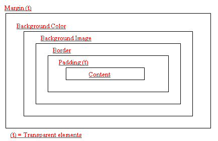
MARGIN |
||||
|
General Comments: These properties let you specify
where an element gets placed within its "box." |
||||
|
Property |
Description |
Values |
Example |
|
|
|
Places the top margin of the element; you can use negative values. |
|
Displays the top margin of the division 2 em spaces down the
page. |
|
|
|
Places the right margin of the element; you can use negative
values. |
|
Displays the right margin of the division 1 em space from the
right edge of the page. |
|
|
|
Places the bottom margin of the element; you can
use negative values. |
|
Places the bottom margin of the div element 10 percent down the
page and diplays the element from the bottom up. |
|
|
|
Places the left margin of the element; you can use negative
values. |
|
Displays the left margin of the division 6 em spaces from the
left of the page. |
|
|
|
Shorthand for all margins |
|
|
|
|
|
Shorthand for all padding |
|
- The top padding will be 10px, |
|
|
|
Inserts padding at the top of the element. (Theoretically. We
have only been able to make |
|
Inserts 12 points of space at the top of every cell in
the table. |
|
|
|
Inserts padding at the bottom of the element. |
|
Inserts 12 points of space at the bottom of every cell in
the table. |
|
|
|
Inserts padding along the left side of the element. |
|
Inserts 2 em spaces at the left margin of every cell in
the table. |
|
|
|
Inserts padding along the right side of the element. |
|
Inserts 2 em spaces at the right margin of every cell in the
table. |
|
|
|
||||
|
BORDER |
||||
|
tables and border properties. |
||||
|
|
Sets the width of the element's border. |
|
Displays a thin border around the division. |
|
|
|
Sets the style of the element's border. |
|
Displays a dashed border around the table. |
|
|
|
Sets the color of the element's border. |
|
Displays a red border around the table. |
|
|
|
Sets the width, color, and style of the border simultaneously |
|
Displays a thick, double, red border around the table.
Diplays a thin, dashed, red border at the top of the table. |
|
|
|
Sets the height of the element. |
|
Sets all button class images to be 70 pixels high. |
|
|
|
Sets the width of the element. |
|
Sets all button class images to be 100 pixels wide. |
|
|
|
Places the element to the left or right and flows text around
it. |
|
Places a button class image to the left margin and flows text
around it. |
|
|
|
Prevents text from flowing around an element. |
|
Places a button class image to the left margin and prevents any
text or other elements from flowing beside it. |
|
LIST |
|||
|
Property |
Description |
Values |
Example |
|
|
Sets the type of symbol that appears in front of a list item. |
|
Unordered list items will use a square bullet. |
|
|
Selects a specific image to serve as a bullet in front of list
items. |
|
Unordered list items will use the image "smiley.gif"
as a bullet. |
|
|
Describes how the bullet marker and text in a list line up with
each other. |
|
Creates the effect of a hanging indent
The bullet and the second line of text are flush left. |
POSITION , VISIBILITY , CURSOR |
|||
|
Property |
Description |
Values |
Example |
|
|
Specifies the category of object an element belongs to: a block
element, like a heading or paragraph; an inline element, like emphasis or anchors;
or a list-item element. If the category is |
|
Hides the content of the paragraph.
Display the contents of the paragraph.
Treats the paragraph as a block element, which can be positioned
separately using the positioning attributes. |
|
|
Sets absolute or relative position of an element. |
absolute |
.locateX {position: absolute; top:0px; left:0px;} |
|
|
Sets absolute or relative position of an element. |
auto
|
Use with the position property to offset element from top,
bottom, left or right of screen. |
|
z-index |
Sets the order that an element gets displayed. |
auto
|
.locateX {position: absolute; top:0px; left:0px; color: red;
z-index:0} .locateY {position: absolute; top:2px; left:2px; color:
green:z-index:1} <span class=” locateX”>WebDev13</span> |
|
|
Describes how white space should be handled within the block
elements. |
|
The paragraph will break only with a specific <br> tag. |
|
|
Sets the cursor style. |
|
|
Pseudo-Classes and
Pseudo-Elements
a:link a:link img a:hover a:visited a:active first-line first-letter |